nodMD
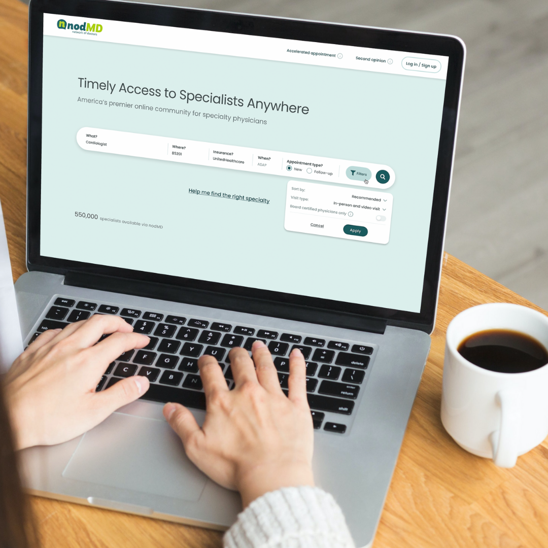
nodMD is a digital health company disrupting the specialty care market by creating America’s premier online community for over 250,000 specialty physicians. nodMD’s focus is to revolutionize the specialty health care industry with an impressive digital health platform.

Project Overview
User Problem
Specialty care has become harder to access, wait times for patients has increased, referral processes are over complicated, and finding a specialist that fits patient needs can be a challenge. Access to specialty care, especially in rural areas, is a struggle for patients for any number of conditions. nodMD created the first specialty physician digital health platform that allows timely access to specialty care.
Project Goals
I was an essential part in creating a digital health platform that incorporated the needs of all that would utilize the platform – patients, primary care providers, and specialty physicians. I joined this project to refine processes, advance designs, and add to agile/lean UX methods to produce an MVP product to launch before competitors advance into the specialty care market. Important features included:
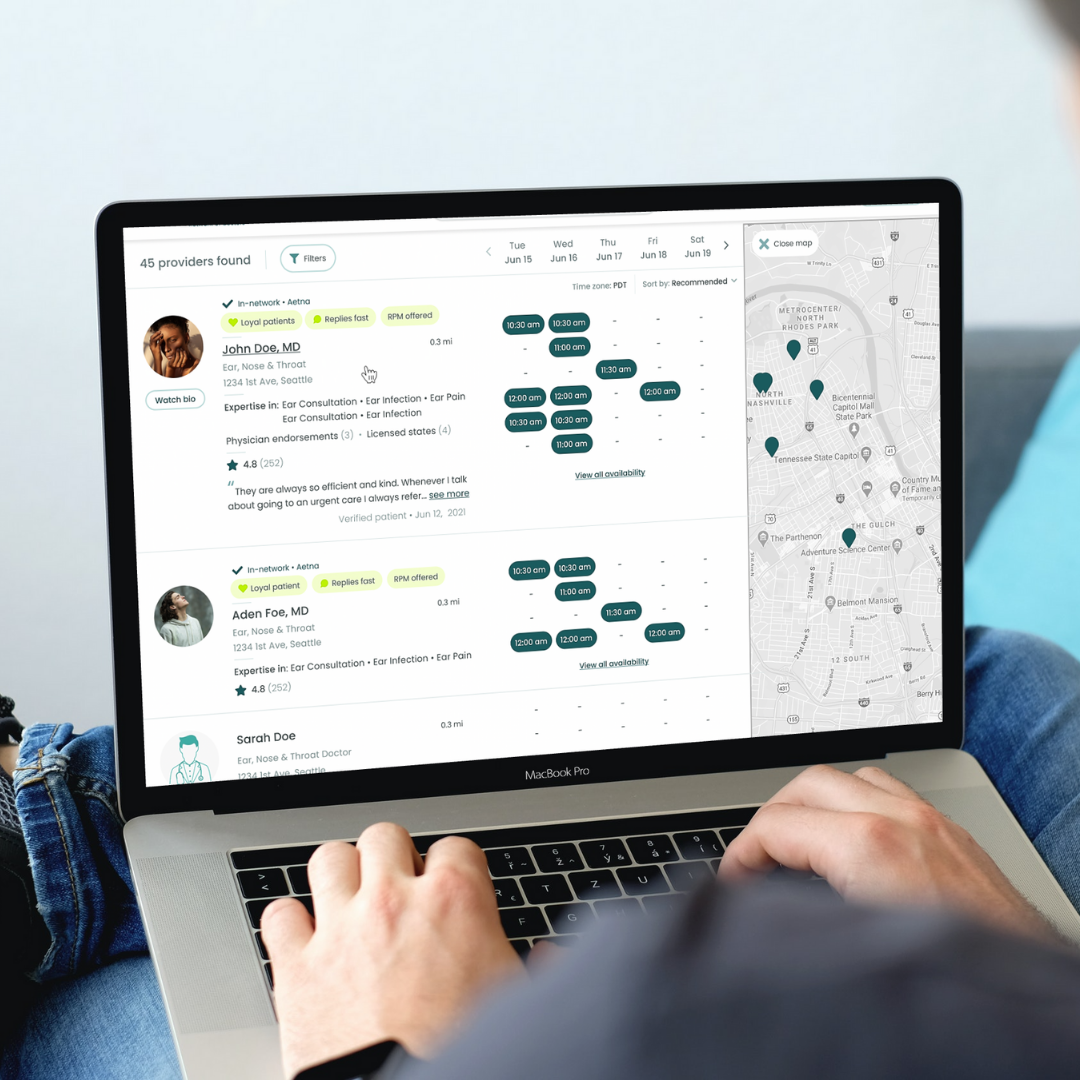
- Enhanced “Find-a-Specialist” Filters
- Customizable features for providers (patient intake forms, schedules/length of appointment depending on patient type, locations)
- Online bookings
- Improved referral process
- Automatic insurance verification
My Role
UX Research
Information Architect
Visual Designer
Usability testing
Collaborated in a cross-functional teams with other UX designers and a team of local and offshore developers

Utilizing
USER RESEARCH
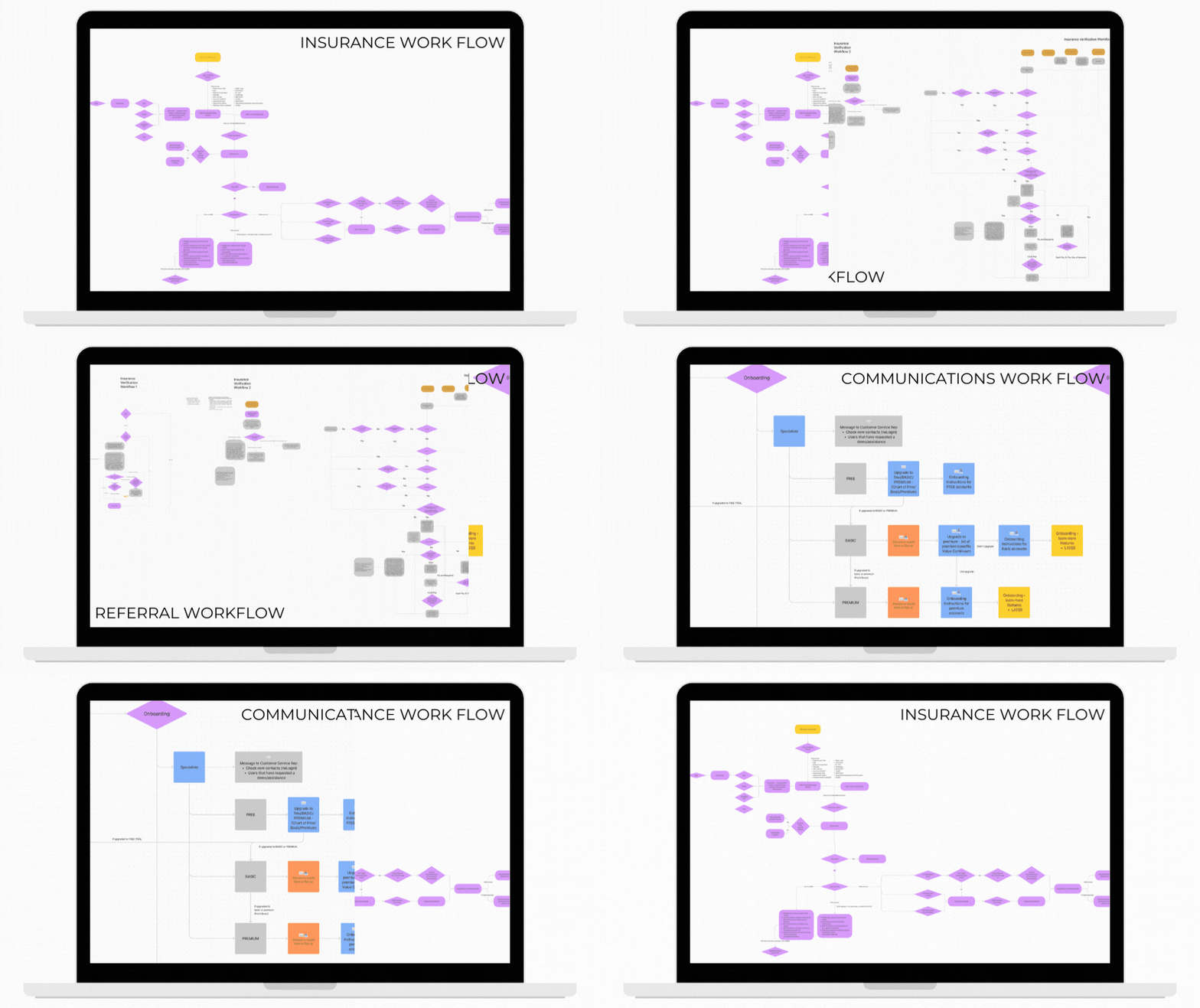
Before I came on to the nodMD project, extensive research had been conducted regarding what the needs of different types of users were. There are three different types of user research that went into this project – patients, primary care providers, and specialty physicians. All three of these user types have specific needs that need to be achieved while creating a robust digital health platform. Overall the information that was collected prior to me joining the team was often referenced while creating different user journeys. From focusing on how referral processes would flow or what communications were being sent from the platform, to how the insurance verification process and how to handle patients with different types of insurance would be processed, I was a major part in ensuring different experiences were designed for each user type.
Advancing
WIREFRAMES & PROTOTYPES
A lot of the initial wireframes were completed when I joined the team, and although I did assist in building some of the frameworks for certain portions of the digital health platform, I mainly focused on refining processes and developing different flows for the referral process, insurance verification process and the communications coming from the system process.

TESTING
Many iterations of the prototypes went through thorough testing phases. Utilizing an Agile/Scrum and Lean UX approach, we developed and advanced multiple processes and user functionality. Over the course of many months we have completed a number of sprints and have advanced our prototypes dramatically. Communication has been key with our internal UX design team and our offshore development team. The majority of testing has been completed by our internal teams and are soon soft launching for a pilot test group.
Goals we have from the user test group are understanding if any features need further development and understanding what we are achieving in the user process.
Final Product
Product Wins
After many months of working through advanced processes, we have finally set the soft launch date for our pilot group on February 28th. Focusing on the MVP, we are ahead of a ambitious goal of launching our digital health platform prior to Q2 2022.

