Marble Works is a top kitchen remodeling center in northern Illinois that offers a wide selection of different types of cultured and uncultured counter tops and cabinetry for any bathroom, kitchen, or industrial builds or remodels.
Project Overview
User Problem
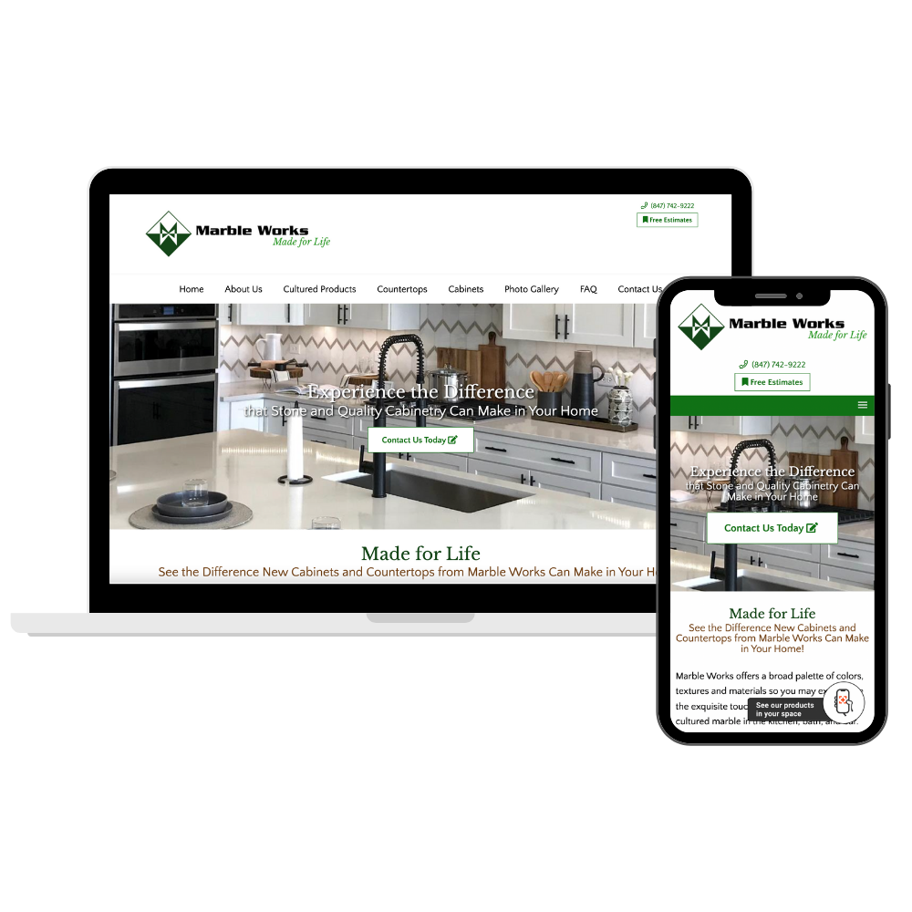
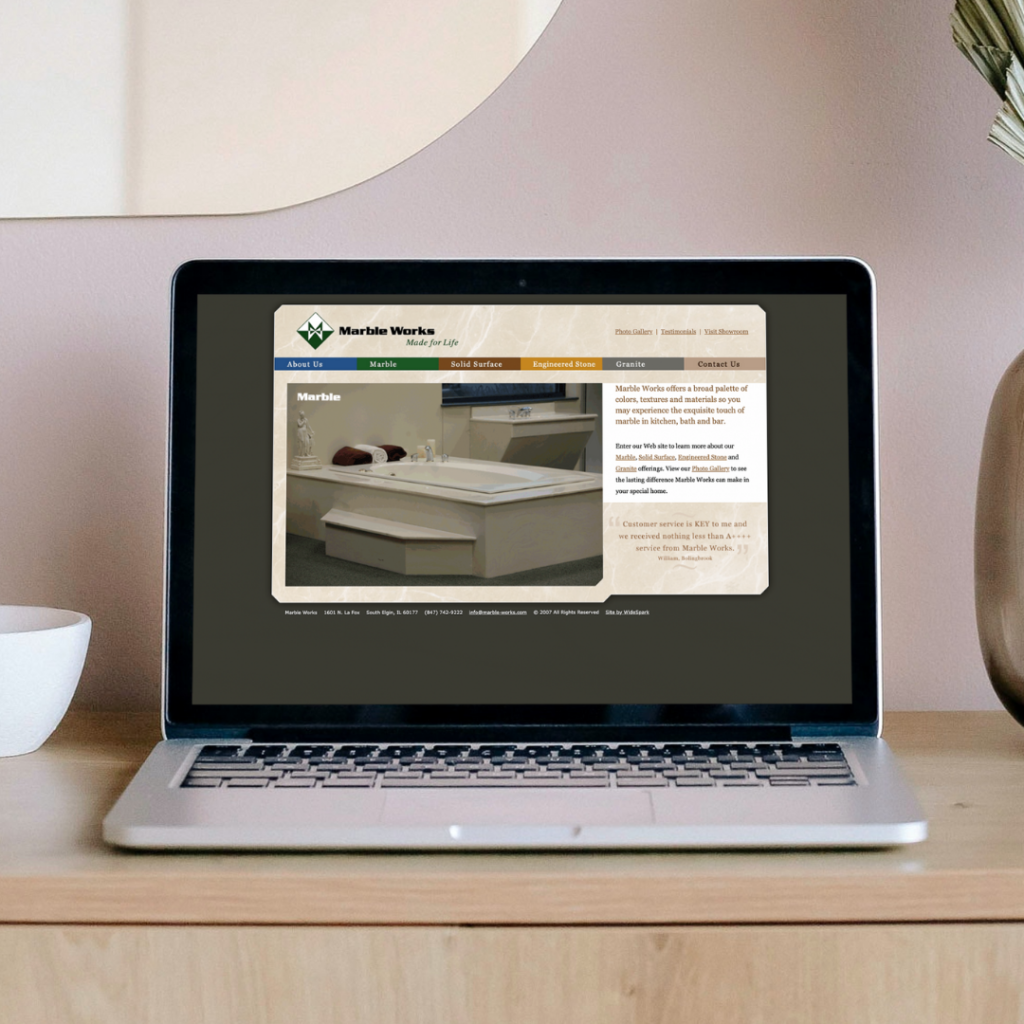
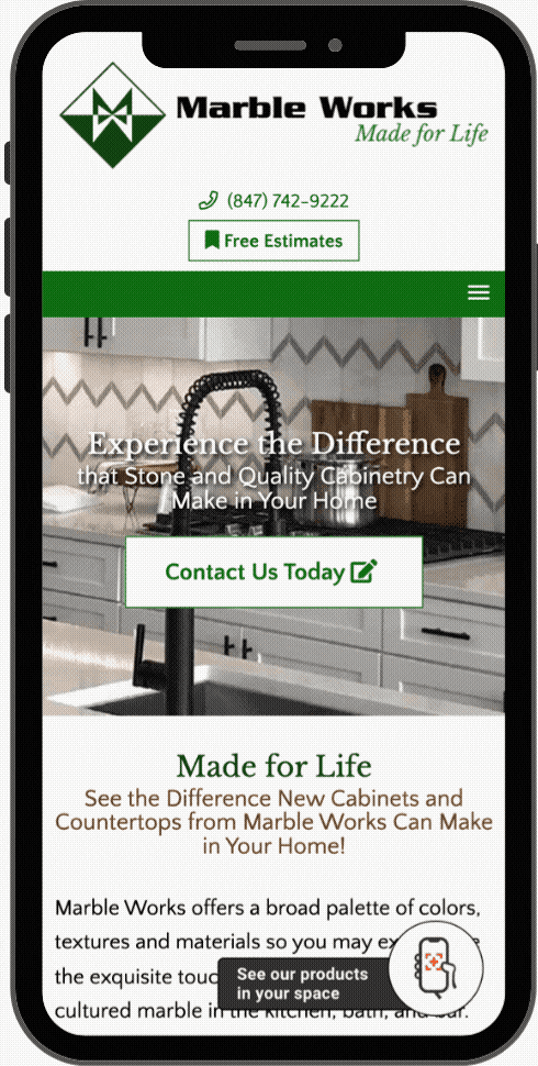
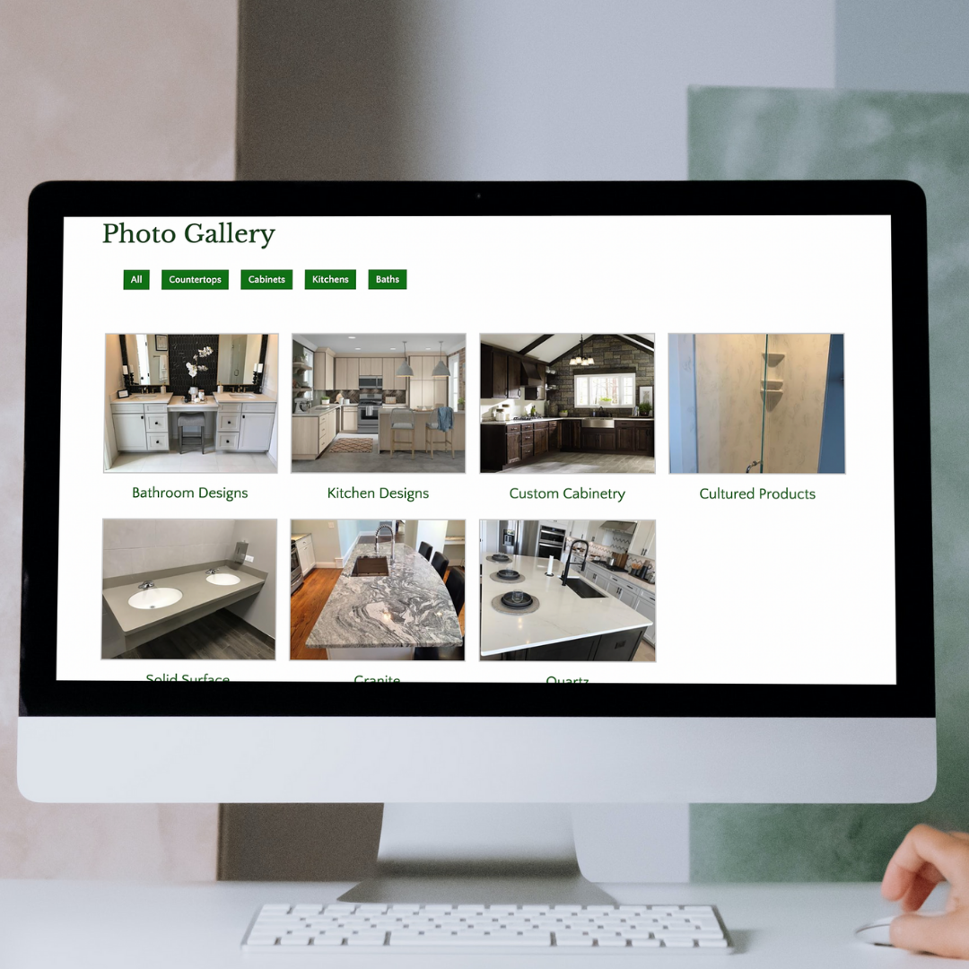
The website for Marble Works was extremely outdated and did not provide a mobile-friendly user experience. The inability to see what products Mable Works offered, or any gallery pictures that showcased the installation work that they have finished contributed to significant issues.
Project Goals
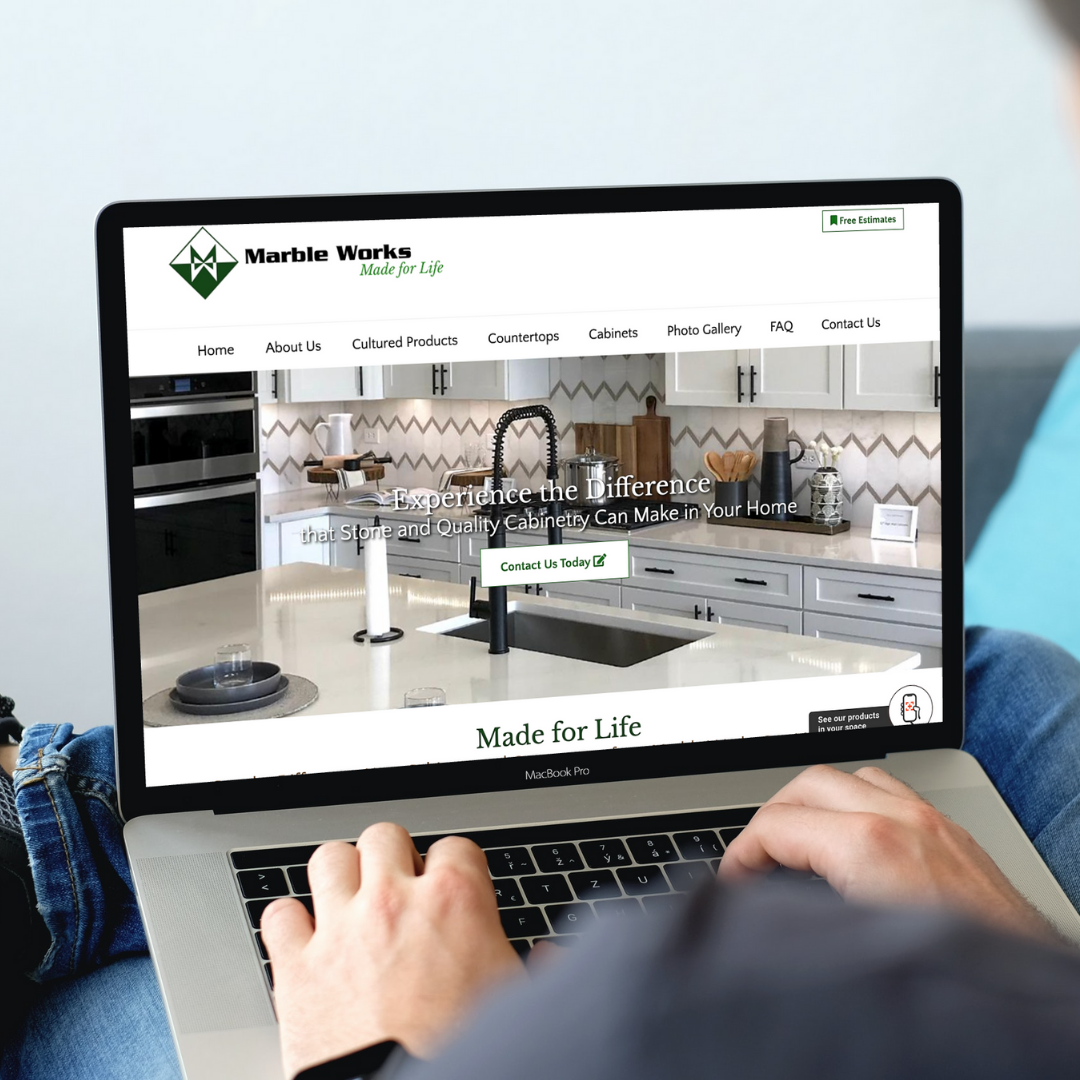
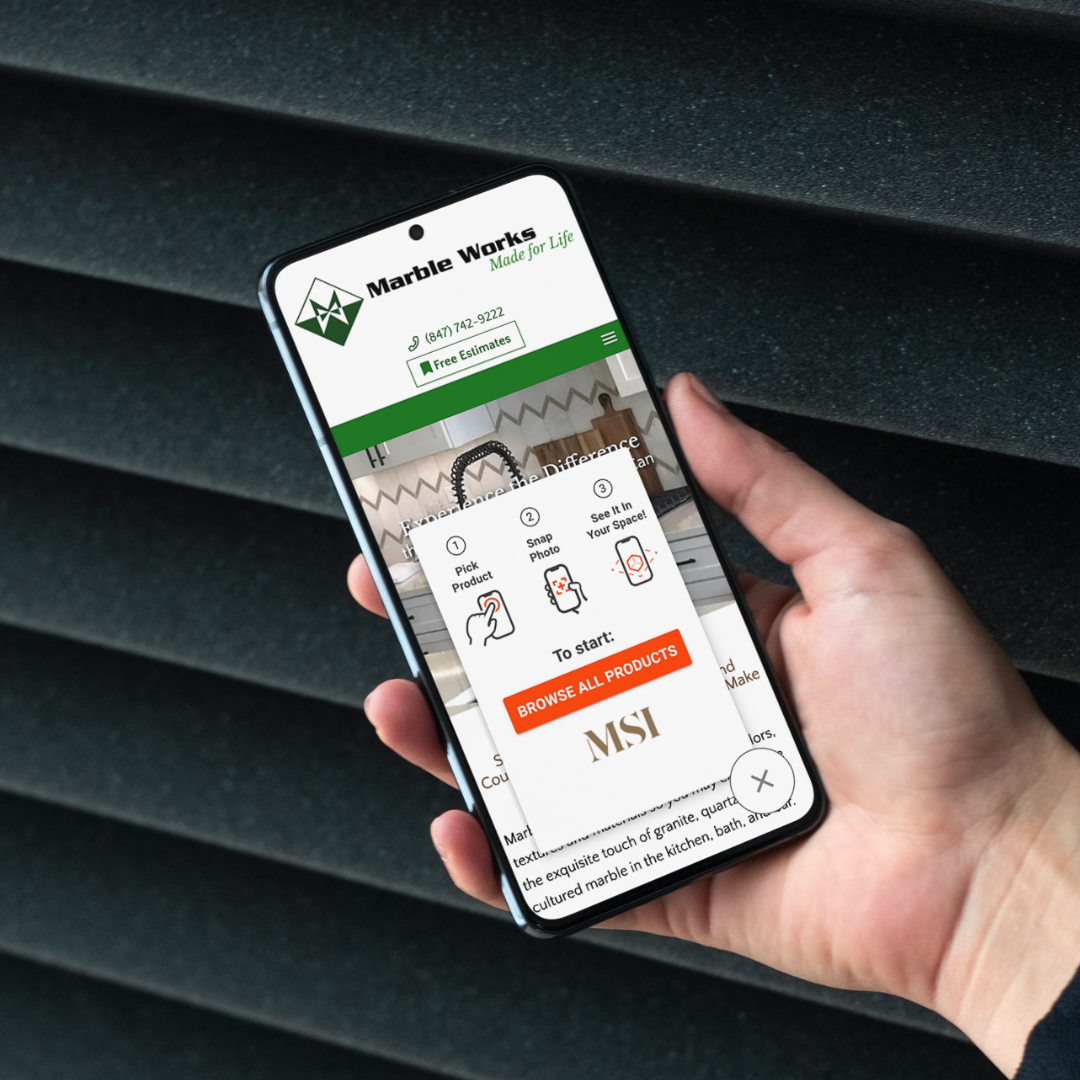
I updated the website design while focusing on the mobile experience for users. It was incredibly important to include the MSI integration where users could physically visualize different cabinets and countertops in their own space. Important features included:
Mobile-friendly design
A thorough gallery of stone samples, and previous installations
Integration of MSI application to view real-time design overlay of existing bathroom or kitchen for users
My Role
Product Lead
Information architect
Visual Designer
Usability Testing
Collaborated in a cross-functional teams with team of developers
Utilizing
USER RESEARCH
The owners of Marble Works had received a lot of feedback on their previous website that they had relayed onto our team during the initial design process of this project. Many of their customers discussed how they couldn’t use the the website on their mobile devices, it was difficult to get directions sent to their phones, and that they weren’t able to access any information easily.
As my team set project goals and started designs for this project, we focused on many of these primary points to ensure that the focus on these user pain-points were addressed.
Beginning
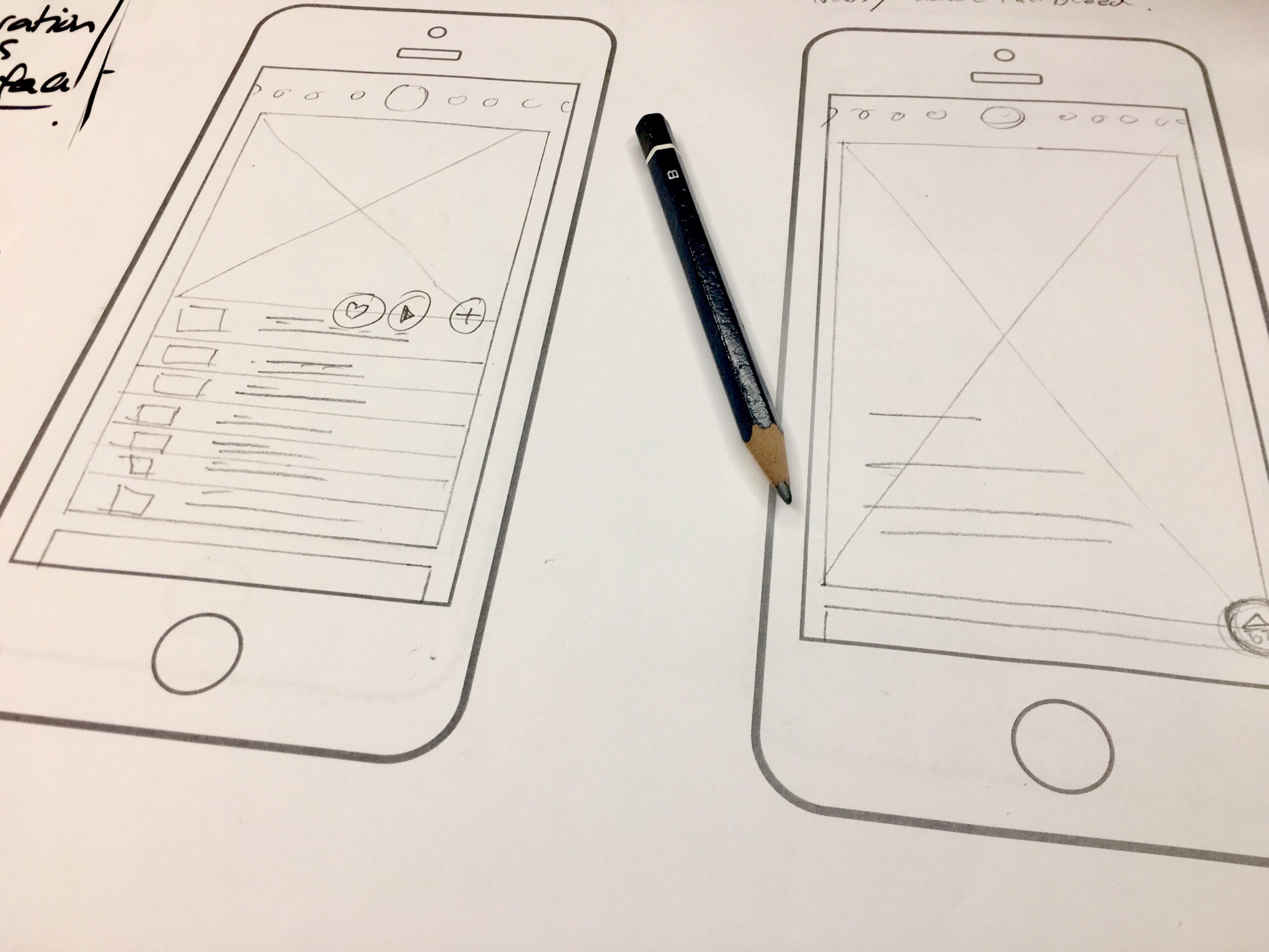
WIREFRAMES & PROTOTYPES
First I started with a layout of pages and including all the pages that were needed for this website build. I sat and laid out all the pages and information, what goals each page were to achieve, and started with initial content that would enhance the user experience. Ensuring all the information that needed to be included and that the layout of pages made sense was incredibly important to note as I began the wireframe designs.
The focus of this project started with mobile-first designs. After I discovered the heirarchy of pages and focused on information architecture, I moved onto creating wireframes in Adobe Illustrator. I focused on creating a clean design that would translate easily to desktop. There were a few main page designs that needed to be created before we could move into the development phase of the project. The first versions of the designs included – home page, inside page, contact page, and gallery page.
TESTING
When working through the testing phase of this project, I worked closely with the development team where we used an Agile approach to complete different sprints of this launch. The internal team was the majority of QA testers when we were going through these sprints to see if any issues from the prototypes were solved and if there were any additional issues that needed addressing.
While working through the QA process, I reached out to teams within the company that were not working on the project to go through the website on multiple platforms and to provide feedback. The testers gave thorough feedback on what was done well and what was still having issues as we were nearing to launch which helped us greatly in launching a polished product.
Final Product
Product Wins
In the following months after the new website launch, the increase of engagement was about 200% from before we launched the new and updated website. The overall traffic increase came from mobile devices which shifted the usage reports from desktop to mobile. The bounce-rate for the mobile websites went from about 98% to 41% in a matter of months.