Fast Life is a mobile application for those who are intermittent fasting to keep track of the length of fasts, free learning resources, and benefits of intermittent fasting.
Project Overview
User Problem
Intermittent fasting has been around a while, but it has become more popular following some influential books that tapped the market and began a booming industry for intermittent fasting apps. Although there are many intermittent fasting focused apps that exist in the apple app store and google play store, the majority of them only allow access after paying premiums to use their products or they have over complicated the process to track fasts. Users want to have a free resource to track their information and see the benefits of their fasts.
Project Goals
As the primary UX designer on this project, I focused on creating an easy-to-use mobile application that made tracking fasts easy and intuitive. Important features included:
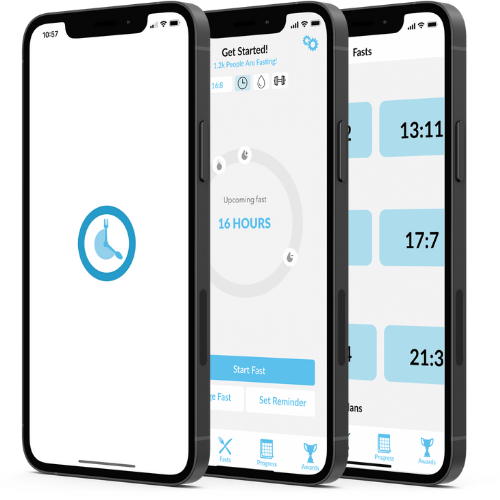
An easy tool to keep track of fasts
Free resources for users
Incentives and personal awards to certain goals users accomplish
Ability to invite and connect with friends and checking in on their progress
A widget for users to add mobile app easily to the home screen for easy accessibility
My Role
Information Architect
Visual Designer
Usability testing
Collaborated in a cross-functional teams with other UX designers and a team of local and offshore developers
Utilizing
USER RESEARCH
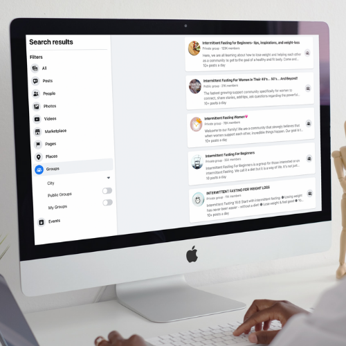
While working with a UX researcher, we found intuitive ways to reach users that tracked their fasts with intermittent fasting apps, including finding target users in intermittent fasting groups on social media platforms. We reached out and asked users if they would be interested in answering questions regarding intermittent fasting apps. Many different users worked with our UX researcher to provide solid information and data on what users like most and disliked most about fasting apps. After creating empathy maps, we found the main focus of points that we wanted to utilize while building this mobile application.
Building
WIREFRAMES & PROTOTYPES
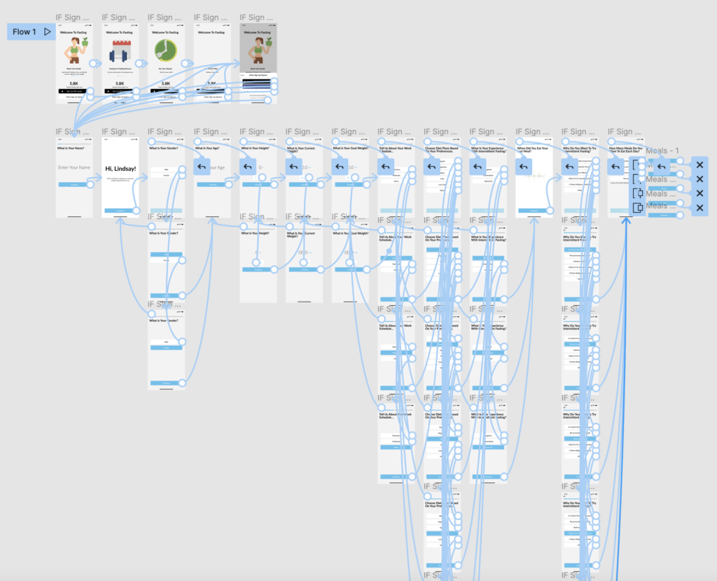
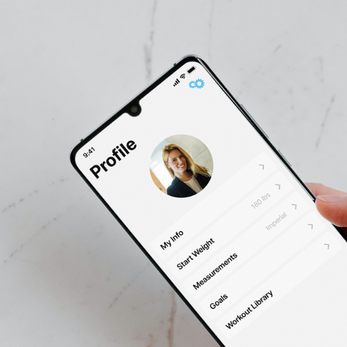
I built the wireframes and initial prototypes in Figma (you can see a sample of the initial sign up process prototype). I wanted to focus on creating a positive user experience even from the start where we made it a personalized experience when collecting the initial information from the user.
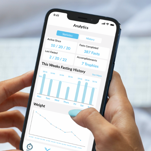
As I focused on creating low-fidelity and high fidelity prototypes, I used an iterative approach to improve designs and processes of moving from one screen to another. Since there were many areas of development in the mobile app (home, water tracking, step tracking, analytics, awards, etc.), I had to create different processes for each different flow that was needed under each section.
TESTING
Although I was following an Agile/Lean UX approach, the testing went through a couple of different sprint phases to ensure that the users were able to navigate the mobile app with ease and that the team was able to deliver a product that achieved the goals based on the research conducted. The team I worked with asked many open ended questions as the users were testing the product to get honest and clear feedback on what features were working, what features needed improving, and even some of the features that didn’t make it to the final product. A lot of iterations went into wireframes and prototypes based on thorough feedback I had received during this project. Overall I was pleased to have a polished product when the mobile application launched.
Final Product
Product Wins
Over the course of a year following the product being released, there have been over 1,000 ratings and over 3,000 people that use the app daily.