Evanston Golf Club
Evanston Golf Club is a Private golf club on the north shore of Chicago.

Project Overview
User Problem
The members at Evanston Golf Club were not using the website to its full capacity. The previous design was not mobile-friendly, and it did not allow for users to make reservations or search for generic information. With that in mind, I created a new website to give members a more useful experience.
Project Goals
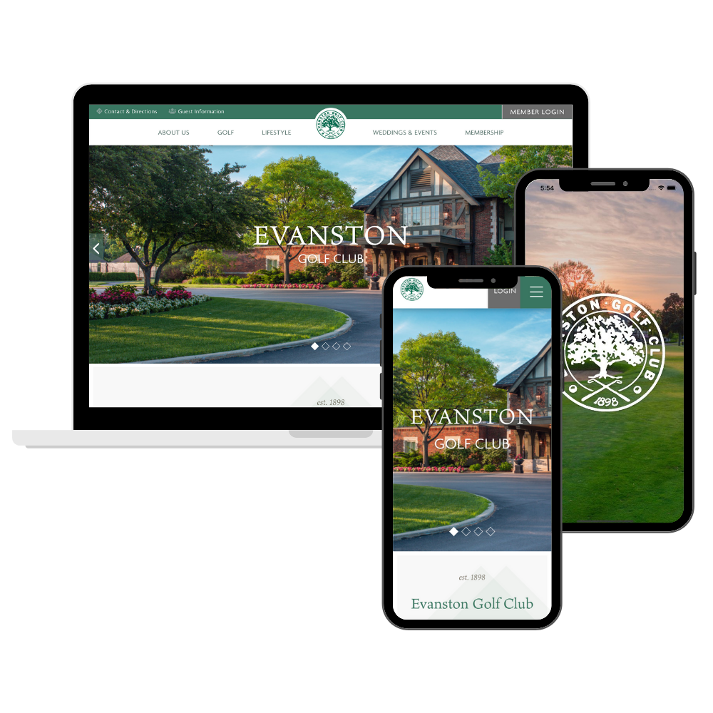
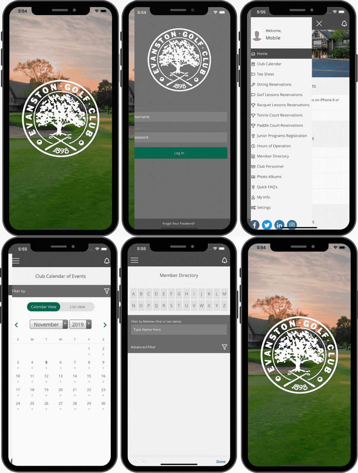
The goal was to create an aesthetic user design to attract potential new members, provide a mobile-friendly version of the website, and enhance the way members could utilize tools on the website. In the end, we developed a beautiful responsive website and mobile app, that included more functionalities including:
- Online tee times
- Online lessons
- Online tennis & racquetball court reservations
- Online dining reservations
- Online billing statements
- Online bill pay
- Online reservations for events & private parties
My Role
UX DesignerResearch
Project Manager
Visual Designer
Collaborated in cross-functional teams
Oversaw and directed developers

Conducting
USER RESEARCH
I worked closely with the club’s communications committee which became the main target user group. In our initial meetings regarding the website redesign, there was a lot of discussion regarding what limitations existed in the website and what features the members were looking for in an updated website and mobile app.
Beginning
WIREFRAMES & PROTOTYPES
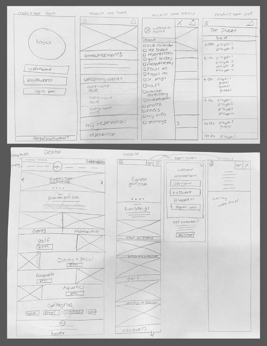
First we looked at websites we liked, websites we didn’t like and started looking at elements that would fit the needs for the members of Evanston Golf Club. From here, I started laying out how the designs should look on mobile and desktop as well as concepts for the mobile app with both sketches and translating them to wireframes in Illustrator.
In addition to initial design concepts, different page concepts were also laid out in a hierarchy of pages using Figma Flows to understand the different sections of the website. We broke these into two different sections – an external view for visitors and non-members, and a member-accessed portal
TESTING
During the testing phase, I used an agile approach to complete multiple sprints with the development team. My focus was on solving a small handful of issues that were occurring with the high-fidelity prototypes and finessing them until the issues were solved.
We leaned on the communications committee and a few additional members to assist with the testing phase and provide feedback on features and suggestions on improvements.
Final Product
Product Wins
After launching the new website & mobile app, our online activity increased by over 50%. Members were making more bookings online, easily making tee times, and increased online bills processed.


