Bloomingdale Parks
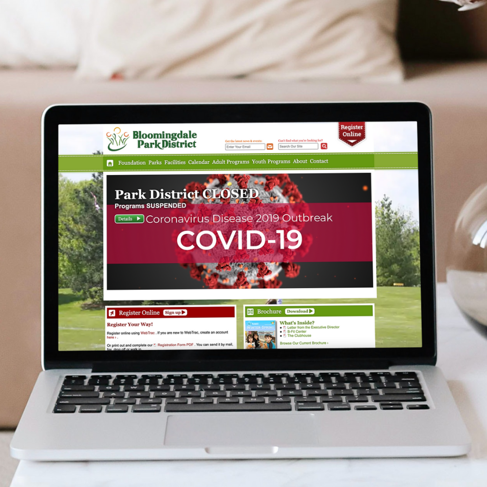
Bloomingdale Park District offered a clunky user experience with many external links to calendars, event sign ups, program registration and more.

Project Overview

User Problem
The Bloomingdale Park District’s website was outdated, lacked quality mobile functionality, and had a complicated online reservation system. Many of the features included in the site were external links to calendars, flyers, posters, sign up programs, registration programs, and more. When reviewing the website statistics, there was a significant amount of desk top users and a very low amount of mobile users.
Project Goals
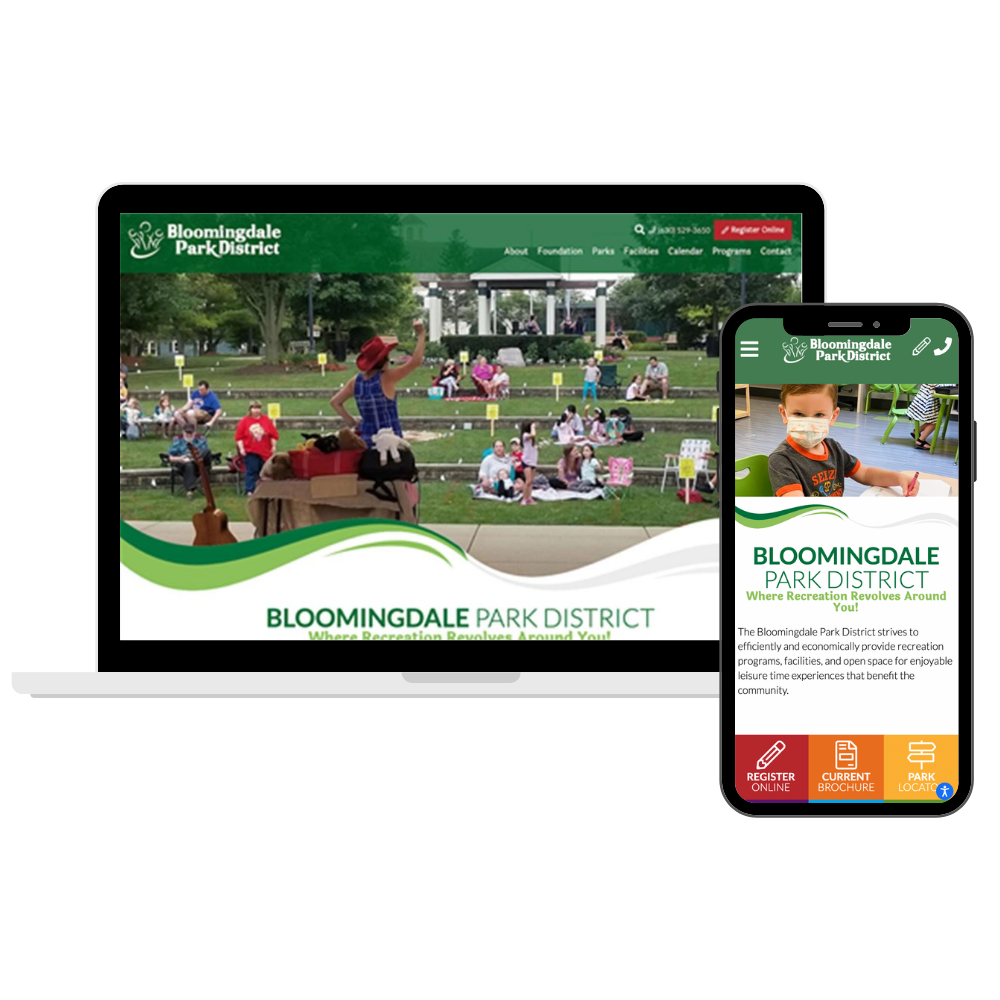
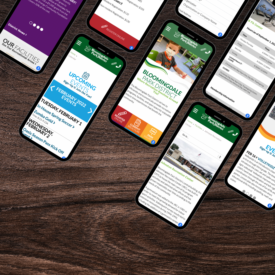
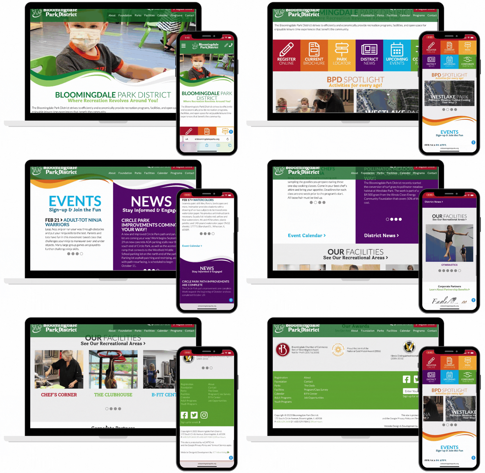
I focused on a mobile-centric design to increase the engagement on mobile phones and to make the programs and links internal versus redirecting to an external website. I ensured that the new website matched the branding on brochures, newsletters, and other print materials to create an experience that translated the branding across multiple mediums. I focused on adding the movement of the “swoops” incorporated in their print products and created a digital website that was aesthetically pleasing and improved the user experience. The final product was focused on these specific goals and elements:
- Mobile-friendly design
- Online registration for events & easy to use online calendar
- Program registration portal that is mobile-friendly and intuitive
My Role
Product Lead
Visual Designer
Collaborated in cross-functional team
Oversaw & provided direction to development team

Existing
USER RESEARCH
As the Bloomingdale Park District is a public entity, we took the results from the annual survey sent out to members of the township to review what they were saying about their online experience. Many were focusing on the lack of mobile-friendly applications that made signing up their kids more difficult as they were quickly approaching the deadline.
I compiled the survey data into an organized spreadsheet that helped identify the most common issues with the user experience on the website. After pointing out the common trends of the users pain points, I listed out the features that most needed to be focused on in the development of our redesign.
Beginning
WIREFRAMES & PROTOTYPES
The focus of this project started with mobile-first designs. Laying out the wireframes in adobe illustrator was the first step. Multiple design iterations were created to give the park district options to choose from and show them multiple uses of incorporating their branding into the overall design.
Over the course of a couple weeks, over 11 iterations of the initial wireframes were created to build out the home page, a generic page, type, and multiple specialty page types. I created high-fidelity prototypes prior to the development stage to ensure that the user experience would be positive, flows would work appropriately, and functionality was a priority when going into the build.

TESTING
During the testing phase, I used an agile approach to complete multiple sprints with the development team. My focus was on solving a small handful of issues that were occurring with the prototype and finessing them until the issues were solved effectively.
The QA process was incredibly thorough and we ensured every link worked, and the responsiveness was appropriate on all screens. I asked other members of the company to spend time using the new website and asking them open ended questions about the website experience to gain any insight and feedback to how users would respond to the updated features.
Final Product

Product Wins
The fall following the launch of the product, we saw the shift of desktop users to mobile users increase dramatically. There was an influx of online reservations for events which overall increased the park district revenue. Lastly, we saw a much more steady flow of users signing up for the different programs through the online registration portal, which allowed the park district to appropriately create schedules and overall grow their programs to be larger as parents were no longer faced with registering closely to deadlines.

